Introducing AI-Powered Dashboard Creation in the Aura Console

Product Manager, Neo4j
6 min read
We’re excited to announce a significant step forward for Neo4j AuraDB users: Dashboards, a powerful new tool in the Aura console. Whether you’re new to Neo4j or a Cypher query wizard, you can use Dashboards to create interactive graph-powered dashboards in minutes. Dashboards allow you to:
- Rapidly generate and enhance dashboards with AI. Create an entire dashboard using an AI-powered dashboard generator and use the GenAI copilot in our new chart editor to generate Cypher queries.
- Visualize and explore your Neo4j data to unlock deeper insights. Create live data dashboards with an extensive collection of interactive charts, and use graph visualizations alongside your charts to reveal hidden patterns and connections unique to your Neo4j data.
- Work across tools and collaborate with ease. Use Dashboards together with Query and Explore in one integrated environment, and effortlessly share your work within the Aura console using the new Sharing feature.
In this post, I’ll show you how to use the new features in the Aura console to create dashboards from your data.
Dashboards in Action: Graph Your Music
When working with connected data, it’s helpful to start with something familiar. Like many of us, I’ve collected thousands of Spotify tracks across dozens of playlists, some organized, most not. What’s interesting isn’t just the tracks themselves but how they connect: artists, genres, and similarities between songs. Let’s explore that data.
Step 1: Data Export From Spotify
As a first step, we export our Spotify playlist data. A neat third-party tool, Exportify can facilitate this by allowing users to log in with their Spotify account and export playlist details as CSV files. After logging in to Exportify, you’ll see a list of all your playlists.

Clicking Export for my Liked Songs, I receive a CSV containing extensive details per track, including release dates, artists, albums, and other song properties. This will serve as the raw data for our graph.
Step 2: Preprocessing Data
For import into AuraDB, this file benefits from being split into multiple entity-specific CSVs, representing the core entities of our intended graph model. I use a simple tool to split the raw liked_songs.csv into four smaller ones:
- songs.csv (URI, track name, duration, song properties)
- artists.csv (artist name)
- albums.csv (album name, record label, release date)
- genres.csv (genre name)
When we open songs.csv, we find a detailed list of song attributes generated by Spotify’s algorithms. These numerical values represent abstract characteristics of each track, offering deeper insight into the music. We’ll use this data later to enrich our graph.

Step 3: Data Import and Graph Modeling
With the data prepared, the next phase involves importing it into AuraDB. Start by setting up your database:
- Ensure that you have a Neo4j Aura account.
- Create a new AuraDB instance. In my case, I’m using an AuraDB Professional free trial:
- 4GB memory / 8GB storage
- Make sure to enable Graph Analytics on instance creation
- If you already have an Aura account, make sure your “Generative AI Assistance” is enabled on the Organization settings. For new accounts, this is enabled by default.
Next, we import the data:
- Navigate to the Neo4j Data Importer tool, accessible via https://console-preview.neo4j.io/tools/import/models.
- Within the Data Importer, create a new data model.
- Upload the preprocessed CSV files (songs.csv, artists.csv, albums.csv, genres.csv).
- Use Data Importer’s “Generate with AI” to automatically generate a model definition.
- Select Run import to populate your AuraDB instance with the graph data.

If the AI model generation encounters issues or requires adjustments, a ready-to-go model can be found here.
Step 4: Create Your First Dashboard
Once the data is imported and modeled within AuraDB, you can create an interactive dashboard:
- Access the Dashboards tab under Tools at https://console-preview.neo4j.io/tools/dashboards.
- Select the Create with AI option from the Dashboards interface. I leave the optional prompt empty, allowing the LLM to propose a dashboard structure based on the underlying graph data.
- Click Generate.
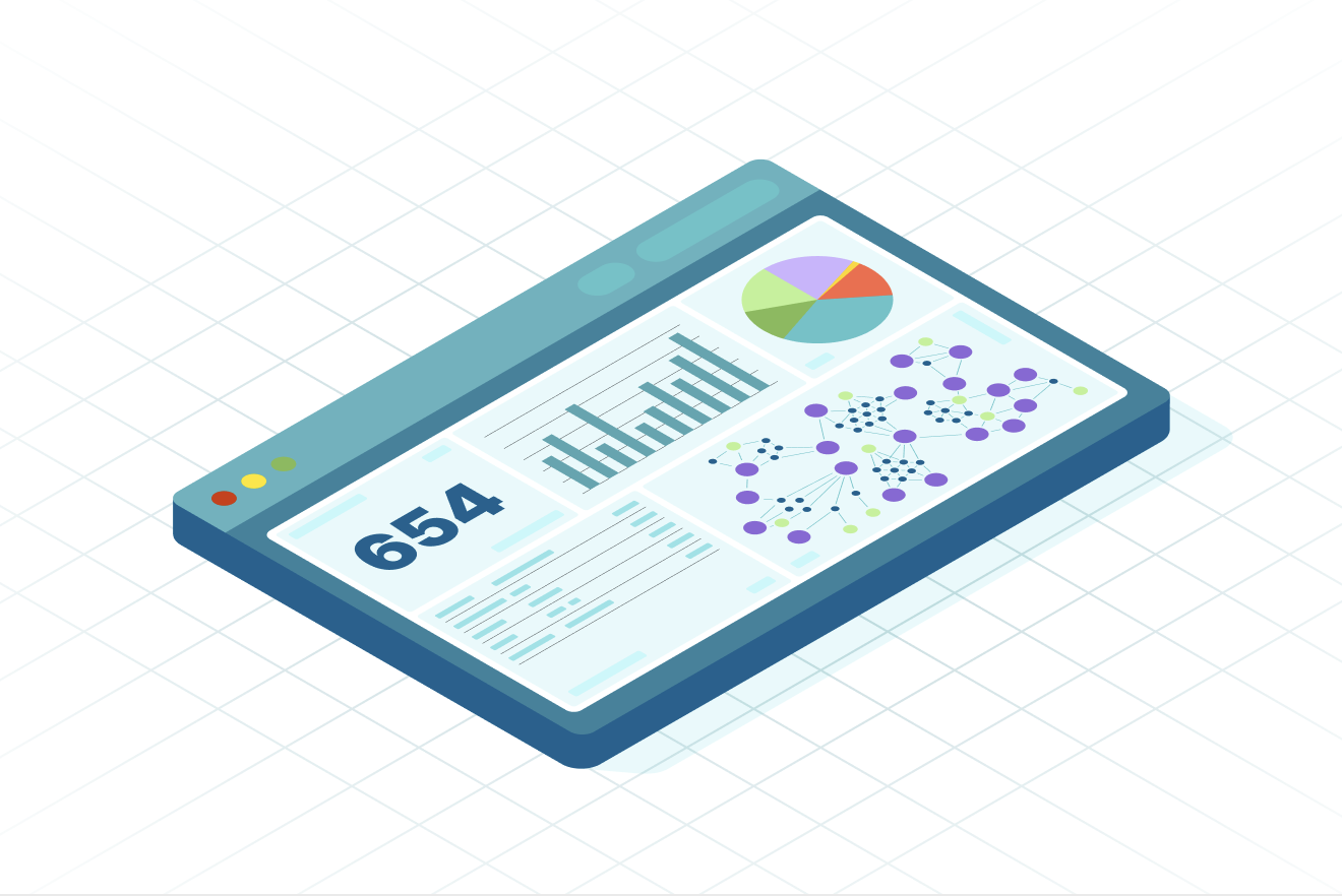
After a few seconds, you have a fully functional dashboard that visualizes your data in different ways. Using this as a foundation, you can add charts, filters, and more, exploring your music in a completely new way. If the AI writes a query that doesn’t answer what you need, you can edit the charts and fix the queries using the Cypher copilot.

From here, I can use our copilot-drafted Cypher queries to create even more charts. I’m interested in looking at genres, since Spotify doesn’t tell me much about these. First, I add a new card to my dashboard, which opens up the card editor. Let’s ask our natural language model to generate a Cypher query to investigate genres:

From here, you can edit the query, as well as customize the graph visualization with a different layout, custom colors, and labels. Each visualization supports its own customizations, allowing you to craft your own dashboard style.

Step 5: Graph Analytics
For those looking to go even further, you can use Graph Analytics to run a workflow of graph algorithms to enrich your graph.
Graph algorithms have a lot of amazing use cases. We’re going to use them to split our large list of songs into individual playlists. The goal: creating groups of similar-sounding songs, taking into account musical properties, shared artists, and genres. The diagram below illustrates the workflow for generating playlists.

For the sake of simplicity, we can implement this workflow in pure Cypher. To run this workflow in the Aura console:
- Ensure that Graph Analytics is enabled for your AuraDB instance (requires a Pro instance with 4GB or higher memory).
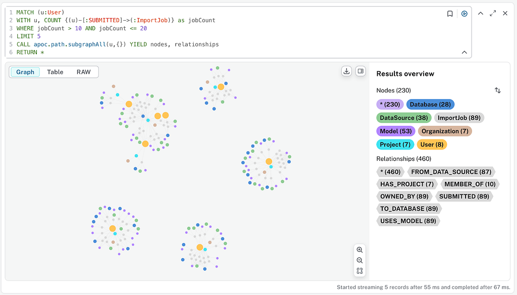
- Open Query and run the workflow:
- FastRP creates an embedding of each song based on properties and neighbors.
- K-means clustering creates a fixed number of clusters based on embedding similarity.
- We now have songs attached to new Playlist nodes in our graph.
- Head back to Dashboards to explore the results.
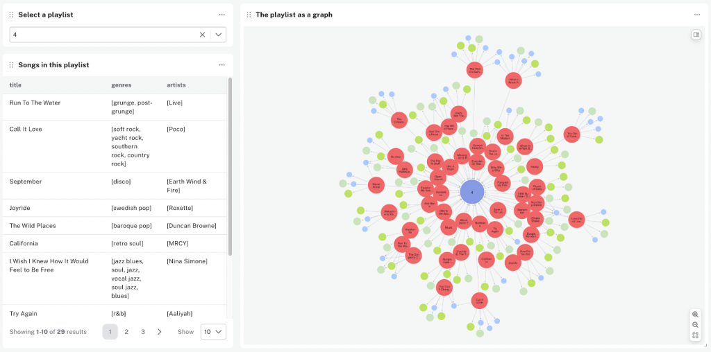
I can now use filters to create an interactive dashboard to investigate the generated playlists. Here’s a dashboard that lets users select a generated playlist, then visualizes the songs in that playlist both in a table and as graph:
We have now transformed raw data into a graph and enhanced it using algorithms, highlighting the versatility of Dashboards for validation, exploration, and visualization. The resulting dashboard is more than a static report: It’s a dynamic starting point for deeper investigation and collaboration.
What’s Next?
Dashboards offer a lot more functionality to make your visualizations even more interesting:
- Add more customizations. Customize charts in a dashboard with different colors, sizes, and more.
- Enhance dashboard interactivity. Add more filters and parameters to make your dashboards dynamic, giving viewers more control and flexibility over the visible data.
- Share your dashboard. When your dashboard is finished, you can share it as a read-only view within your Neo4j Aura project, allowing recipients to explore the data on their own.
Resources
If you’re interested in learning more about Dashboards, take a look at the Dashboards section of our documentation or watch a demo video.
You can also learn more about Neo4j Aura or try it for free.
Share Article


Explore
Related Articles

Build a Private Network Path to Aura on AWS, Azure, and Google Cloud Using Terraform

Streamline Data Ingestion With the Neo4j Aura Import API

Bolster Your Cybersecurity by Visualizing Attack Graphs With Neo4j & G.V()