Editor’s Note: This presentation was given by Michela Ledwidge at GraphSummit 2022.
During Neo4j’s inaugural GraphSummit, we had the pleasure of hosting partners and customers to share insights and stories behind their connected data experiences. We will be featuring more of them in this series of blogs – so watch this space for more recaps. For the third presentation in the series, we’re featuring Michela Ledwidge, Co-founder and CEO of Mod. She showed us how Mod uses Neo4j for spatial visualization across creative storytelling, management of project data and development of prototype consumer productivity app, Grapho. She demonstrated 3D data that is intuitively explorable and manipulable in Extended Reality (XR), making complex data accessible to people without a technical background.
Enjoy! And for more information, please write to me at daniel.ng@neo4j.com.
Here at Mod, we produce film, TV, and games, while also performing a lot of R&D. Much of my career has involved working with graphs and visualization, even back to the early days of the web where we were using the H3 visualization tool to do the first wide-scale mapping of the internet as a whole.
A year or two ago, our studio worked on the set of a feature film that you can watch on Hulu or Amazon called 2067, where the dataset we visualized is actually people. There are a lot of holograms in the movie’s plot, and just before they started shooting, they decided to bring us in because of our expertise in creating these holograms. We used depth cameras, and for the first time in our studio’s history, were able to capture dramatic acting scenes live on set as point clouds, creating lots of data that needed to be mapped.
Building User Friendly Data Tools for Non-Technologists
I’ve always been really excited by the idea that as expert technologists we have access to incredibly powerful tools. I feel that it’s our obligation to make these tools more user friendly and expand them out for non-technologists to use.
Back in the ’90s, I was leading a team at boo.com, an infamous European startup, and we were using 2D visualizations to map the entire company’s operations in real time.
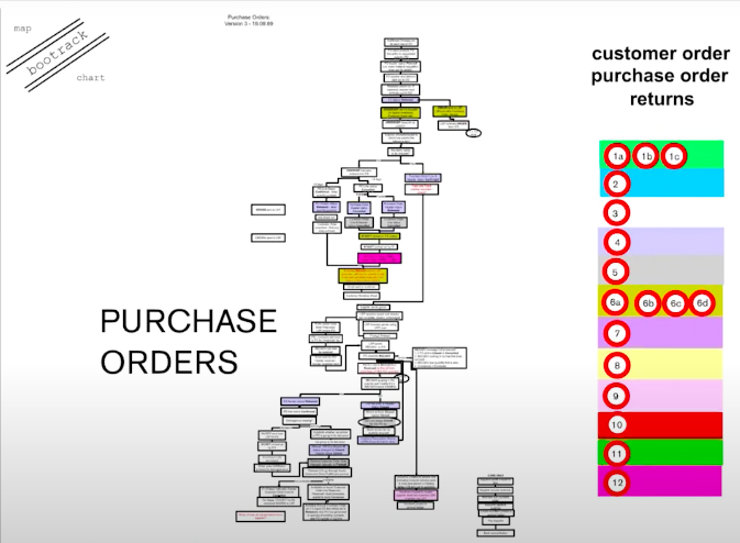
This map used Flash, a technology that’s now pretty much obsolete and is definitely not a spatial 3D representation. And they kept it 2D for good reason. When you start presenting three-dimensional information on a two-dimensional interface, studies find that viewers face all kinds of cognitive problems, making it difficult to understand what’s occurring. As a result, when we create our data visualizations, often using game engines like Unreal, we keep them pretty simple.

This was another project we loved doing last year. We were working with Google to celebrate the success of K-Pop sensation BLACKPINK, who set the Guinness World Record for the most views on YouTube, with over a billion views. We wanted to celebrate what BLACKPINK can do and see where their fans are in real time, so we built some microservices to make this real-time globe sync system dance to the music of their best track. The globe showed you where the audience was saying they were coming from. This visualization is pretty simple in comparison to the data sets I’ll demo today.
About four years ago, we got serious about a topic that was quite personal to me: equality for LGBTQI people. Leading up to this lobbying and funding project, I thought we could use the promise of spatial media to help with the storytelling around polarizing data sets where there are very different opinions, where the data has gaps, and even where the data is contested. This evolved into a project that we shipped last year on Steam, the game platform. This project is a collection of experiments where we aim to find if presenting the data visualization in spatial media adds something to the exploration experience.
Around this time, I was introduced to Neo4j through the Panama Papers investigation and I was inspired to use it. The Panama Papers project was an opportunity to see how non-technologists, journalists, used complex data sources, and what occurred to me was that we were creating a tool that’s going to be released as a video and then potentially an interactive home experience. Just then, COVID hit, and we decided to focus on getting the project into people’s homes as quickly as possible. The goal was to create something that’s as simple as PowerPoint (our audience wasn’t going to use Neo4j Bloom for exploration). So how can we add value to the data we share with them? We decided to provide curated paths through the data, showing money trails that start off as Cypher queries.
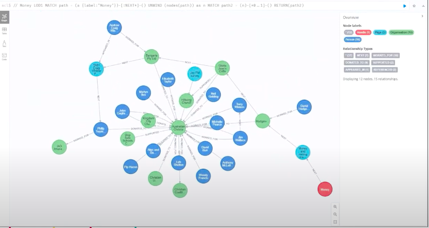
Here, we see a subset of the data in the Neo4 interface, ultimately showing you a collection of relationships.
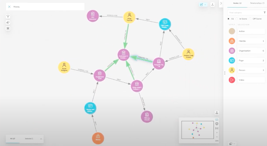
This is another example of a money trail visualized in Neo4j Bloom. We wanted to know if we could go beyond this visualization.
Demo: Graphs Visualized in Virtual Reality
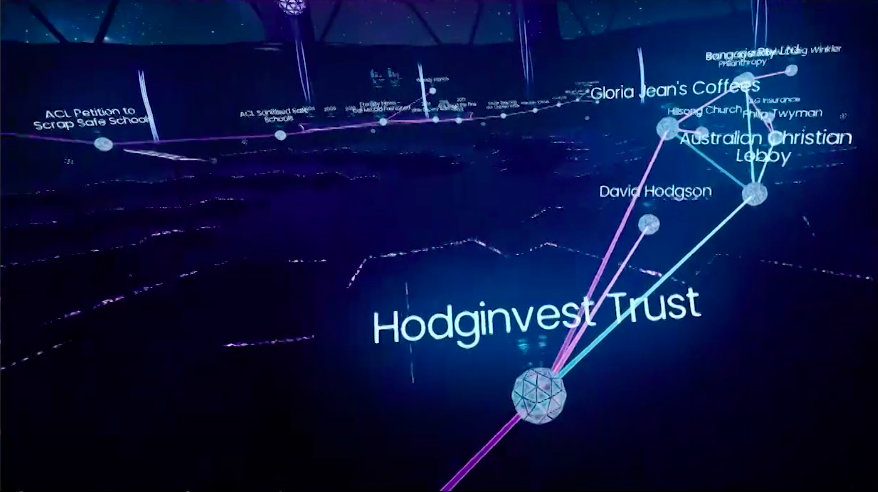
What we ended up with is something I like to think of as Minority Report meets Four Corners:
Demo: Grapho
I’m going to jump to a different prototype that we’ve been building. This dataset runs off a little virtual reality headset, which is a bit like having an Android phone stuck to my head. In this tool, we’ve thrown away the complexities of the visuals you’ve just been looking at, because we wanted to see if we could widen access to this interactive tool:
Once you start using this kind of technology for exploring data and finding insights, there are huge opportunities for collaborative work. Being able to use a third perspective from a witness camera is something that we’ve also been doing a lot of research on.
User Interface and Experience Design
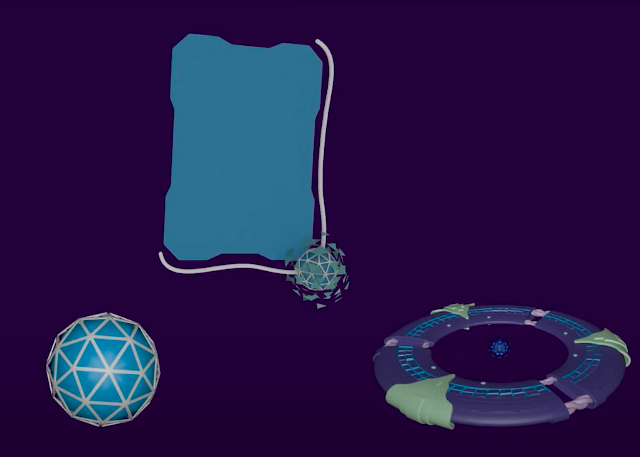
Ultimately, the design process is about boiling down what could potentially be the most useful elements of this experience. In the visualization, we use these Frisbee-like discs to handle data and distinguish the data points from what’s in the neo4j graph and what are visualization starting points. This gives non-technical users a way in. We see a huge opportunity for tools like Neo4j to support a broad range of backends and functionality, including Neo4j’s wonderful data science algorithms.
There’s a real need for collaborative research to improve the experience. We want to make sure decision makers are not just looking at PowerPoints and other preconceived static media when the opportunity is so much richer. Our big goal is to release a prosumer tool that allows people to put their data into VR or AR-type experiences as easily as possible.
Demo: Ecological Datasets for Heritage Listed Trees
I want to leave you with one last demo, this one using an ecological dataset, that I’m particularly excited about:
What’s Next
We’re continuing to explore games as well as data journalism stories, particularly around ecology. We’ve been working with APNIC to see how internet forensics could potentially benefit these kinds of activities. We foresee big challenges: you’re going to hear more about new lightweight devices, smaller footprints, and wearables, but they’re all really clunky. However, despite these challenges, none of this is going away. Augmented Reality is here to stay.
Watch the Webinar Now


