Graph Data Science for Supply Chains – Part 2: Creating Informative Metrics and Analyzing Performance in Python

Data Science Product Specialist, Neo4j
10 min read
In part 1 of this series, we demonstrated how supply chain data can be modeled into a graph, imported into Neo4j, and analyzed using Graph Data Science (GDS). We walked through how to visualize the supply chain in Bloom and used the new GDS integration to understand operational load, flow control, and interdependence between different airports.
While Bloom is great for visualization and experimentation, we can work with GDS and Neo4j in a more direct & programmatic way through Python to better operationalize our analysis.
In this post, I demonstrate how to use Neo4j Graph Data Science in Python to capture key centrality and community metrics. This methodology is preferable to Bloom when you want to run metrics over your entire graph, write results to your database, or have access to the full set of GDS capabilities. I will then show how to use the results for downstream inference where we investigate their associations’ delays at different airports, demonstrating how the logistics network structure may affect freight delivery performance.
We will be using the same dataset as we did for part 1, the “Cargo 2000” transport and logistics case study dataset. If you are interested in the details on the dataset or how to ingest it into Neo4j, please see part 1 of this series.
Identifying & Interpreting Graph Based Metrics
In part 1, we learned about graph algorithms relevant to supply chain analytics. Below is a summary for how to interpret the results of these algorithms. I’ve also added an additional centrality algorithm: Eigenvector centrality.
- Degree Centrality measures the operational load for stages in your supply chain. According to the study The association between network centrality measures and supply chain performance, stages with high operational load have to manage larger inflows and outflows and may be forced to reconcile conflicting schedules and priorities more often. All else held constant, stages with higher operational load tend to require more resources to run effectively.
- Betweenness Centrality measures the flow control for stages in distribution and logistics networks. Stages with high Betweenness Centrality have more control over the flow of material and/or product because they connect many other stages together that may otherwise be disconnected or connected through much longer less efficient paths. All else held constant, stages with higher flow control present higher risk for causing bottlenecks in supply chains if they encounter delays or other issues.
- Eigenvector Centrality measures the Transitive Influence of stages in a supply chain. Stages with high Eigenvector Centrality are depended upon by other critical stages. These stages have high transitive influence because delays or other performance issues for these stages have a higher risk of carrying over or propagating to other critical stages in the supply chain.
- Louvain Community Detection finds regional interdependencewithin the supply chain network by identifying groups of stages which have highly interconnected flows between them. All else held constant, Stages within the same group have a stronger interdependence on each other relative to stages outside the group.
Running Algorithms with Neo4j Graph Data Science in Python
We can run all of the above algorithms through a python program or notebook using the Neo4j Graph Data Science Python client. This is demonstrated briefly below. As always, the full code for replication, as well as links for importing the data into Neo4j, is located in this notebook on GitHub. If you want to follow along, you can create a free sandbox [here].
First you connect to Neo4j using the `graphdatascience` python client like so.
from graphdatascience import GraphDataScience

# Use Neo4j URI and credentials according to your setup
gds = GraphDataScience('neo4j://localhost', auth=('neo4j', 'neo'))
Then you create a graph projection with the relevant nodes and relationships.
A graph projection is a scalable in-memory data structure optimized for high-performance analytics. It can be seen as a materialized view over the stored graph and allows you to run algorithms quickly and efficiently over the entire graph or large portions of it.
g, _ = gds.graph.project('proj', 'Airport',
{'SENDS_TO':{'properties':['flightCount']}})
After the graph projection step, you can run algorithms via procedure calls. There are various execution modes for these procedures which allow you to summarize, stream, or save the results in different ways. In this case you can use the `write` execution mode to write results back to the database. Below is an example for the 4 centrality algorithms covered above.
# calculate and write out-degree centrality
gds.degree.write(g,relationshipWeightProperty='flightCount', writeProperty='outDegreeCentrality')

# calculate and write betweenness centrality
gds.betweenness.write(g, writeProperty='betweennessCentrality')

#calculate and write eigenvector centrality
gds.eigenvector.write(g,relationshipWeightProperty='flightCount', writeProperty='eigenvectorCentrality')

# drop the graph projection
g.drop()
Out-Degree and In-Degree Centrality
In the above procedure calls you will notice that I use the term `outDegreeCentrality` to refer to the result of the degree algorithm. This is because the relationship orientation in the graph projection is directed by default and so the relationships being counted are those going out from the nodes only.
To capture the count for relationships going into the nodes (.a.k.a in-degree centrality) we can re-project the graph in a `REVERSE` relationship orientation and run the degree algorithm on that.
# projection with reversed relationship orientation
g, _ = gds.graph.project('proj', 'Airport', {'SENDS_TO':{'orientation':'REVERSE', 'properties':['flightCount']}})

# calculate and write in-degree centrality
gds.degree.write(g,relationshipWeightProperty='flightCount', writeProperty='inDegreeCentrality')

# drop the graph projection
g.drop()
Now instead of having a single degree centrality result we have two. In effect, the out-degree centrality measures the operational load of outbound shipments from the airport, while in-degree measures the operational load of inbound shipments to the airport. The sum of the two is the same as the degree centrality we calculated in Bloom in part 1 of this series. Separating degree centrality into in-degree and out-degree here will help with assessing the effect of operational load on performance in upcoming analytics.
Louvain Community Detection
Louvain shows us regionally interdependent sub-networks in the supply chain, that have lots of internal connections. To run Louvain, we will use an `UNDIRECTED` relationship orientation which will allow Louvain to consider inbound and outbound directions equally when constructing communities.
# project with undirected orientation
g, _ = gds.graph.project('proj', 'Airport', {'SENDS_TO':{'orientation':'UNDIRECTED', 'properties':['flightCount']}})

#run Louvain algorithm and write back to the database
gds.louvain.write(g, relationshipWeightProperty='flightCount', writeProperty='louvainId')

# drop the graph projection
g.drop()
Investigating Algorithm Results
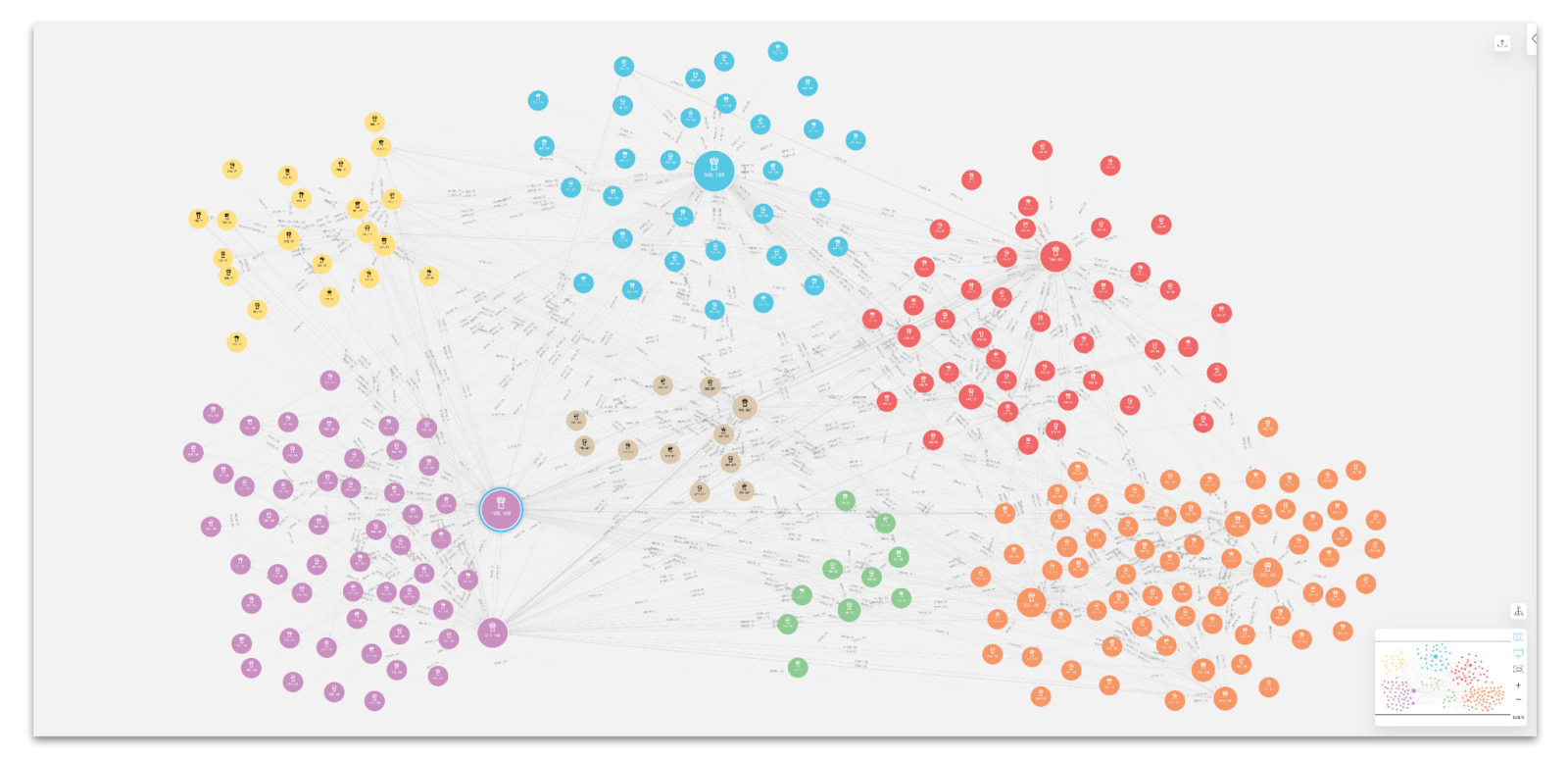
In contrast to using GDS in Bloom where you compute algorithms for only the nodes rendered in the scene, python (or procedure calls in Neo4j) enables you to compute algorithms across the entire graph or large portions of it. You can also stream the results or save them in various ways. In this case we are writing results back to the database. This means the results are persisted and we can retrieve them with Cypher.
Below is an example of using Cypher to retrieve an ordered list of top 5 airports for betweenness centrality, as well as their in-degree, out-degree, and eigenvector centrality scores (the top 5 are similar across all 4 centralities, the notebook contains more details.)
gds.run_cypher(f'''
        MATCH(a:Airport)
        RETURN a.airportId AS airportId, a.name AS name,
            a.betweennessCentrality AS betweennessCentrality,
            a.outDegreeCentrality AS outDegreeCentrality,
            a.inDegreeCentrality AS inDegreeCentrality,
            a.eigenvectorCentrality AS eigenvectorCentrality
        ORDER BY betweennessCentrality DESC LIMIT 5
''')
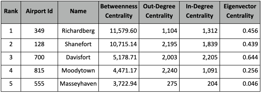
Top 5 Betweenness Centrality Airports with Other Centrality Results
The betweenness centrality results should be identical to those we calculated in Bloom in part 1 of this series. For degree centrality, after breaking up into in and out degree, we see that we still get mostly the same contenders: Davisfort, Shanefort, Moodytown, etc. However, they are ordered differently with Moodytown having the highest out-degree centrality and Davisfort the highest in-degree. Ultimately, it appears that the flow of freight is not evenly distributed with operational load. Instead, some airports serve more as senders of freight, like Moodytown, and others, like Davisfort, serve a bit more as delivery destinations and/or transfer points.
Eigenvector centrality seems to correlate strongly to in-degree centrality in this case, with Davisfort, Shanefort, and Richardberg being the top 3. More often than not, these different degree centrality metrics are positively correlated, but it varies across different graphs.
To obtain a summary of Louvain results with Cypher, we can relabel each Louvain community with highest betweenness airport names, and retrieve the number of airports in each Louvain community or “region”.
# relabel Louvain Communities (a.k.a. Regions) by the highest betweenness centrality airport name
gds.run_cypher('''
    MATCH (a:Airport)
    WITH a.louvainId AS louvainId, max(a.betweennessCentrality) as maxBC
    MATCH(a:Airport) WHERE a.betweennessCentrality = maxBC
    WITH a.name as regionLabel, louvainId
    MATCH(a:Airport) WHERE a.louvainId=louvainId
    SET a.regionLabel = regionLabel
    RETURN count(a)
''')

Using Graph Algorithms as Predictive Signals
You’ve probably heard that graph algorithms give you better predictions using the data you already have. But is that true? In this section, we’ll explore how centrality metrics can be used to predict delays. For example, you may hypothesize that airports with higher operational load become congested and more often experience delays in process times beyond what they originally predicted. You could similarly hypothesize that nodes with high betweenness centrality experience delays due to the need to reconcile shipments along many disparate routes.
Inference, identifying the association between graph algorithms and tangible outcomes, can help uncover trends around performance in the supply chain and result in actionable insight. For example, if we found that betweenness centrality predicted delays, we could add extra resources to highly central airports.
It’s reasonable to hypothesize that the centrality metrics affect the probability of transport delays. To test this hypothesis, and quantitatively estimate the effect, we can use a logistic regression model. We will focus specifically on the transport “RCF” step, where freight is transported by air and arrives at the destination airport. Upon arrival, freight is checked in and stored at the arrival warehouse. We will set up a 0-1 indicator which will be 1 if there is a 30 or minute delay. The delay is calculated by taking the difference between the effective and planned minutes, which is available for all of the business processes in the Cargo 2000 dataset.
Defining Independent Variables (Features) for Logistic Regression
The main variables of interest for our hypothesis will be the centrality metrics of the arrival/destination airport:
- logBetwenness: ln( betweenness centrality + 1)
- logEigenvector: ln( eigenvector centrality + 1)
- logInDegree: ln( In-degree centrality + 1)
- logOutDegree: ln( out-degree centrality + 1)
Note: Since the Cargo 2000 case study dataset was taken over a 5-month window, in-degree and out-degree centrality should be interpreted as estimates per 5 month period
To help with model fitting, we will add 1 to each metric and take their natural log. Without going into too much detail, this transformation will help expose a linear correlation to the response which is easier to estimate in the logistic regression model.
We will also include various control variables.
- interRegional: A 0-1 indicator for whether the flight went between two airports of different “regions” (i.e. Louvain community) or within the same region.
- logSourceOutDegree: The log out-degree centrality of the departure airport. The theory being that flights arriving from more active airports along more common routes may have more accurate planned time estimates and potentially more dedicated ground resources.
- Fixed Effects for Each Airport: A 0-1 indicator variable created for each airport. Each variable will be 1 for flights where the destination airport aligns to their respective associated airport and 0 otherwise. Fixed effects will help control for airports that may be inherently good or bad at predicting transport times due to other factors that are difficult to capture quantitatively and not 100% correlated to centrality. Examples include things like management quality, resource availability, and local weather patterns.
Adding controls like these helps ensure we are taking into account a holistic set of factors associated with the delays so when we estimate the effect of the centrality metrics they are as close to causal effects as possible.
Running Logistic Regression and Interpreting Results
To ensure the model is estimable without getting into complex statistical techniques, I will only consider airports with 100 or more incoming flights. This results in a dataset of 12,762 flights arriving at 35 of the most active destination airports.
Below are the results including a table of coefficients with t-statistics, p-values, and confidence intervals for interpreting statistical significance. As with before, all the code for pulling the data, performing transformations, sampling, and fitting the model is contained in the notebook.
Logit Regression Results
=================================
Dep. Variable: wasDelayed
No. Observations: 12762
Model: Logit
Method:MLE
Df Residuals: 12724
Df Model: 37
Pseudo R-squ.: 0.1265
Log-Likelihood: -4338.5
converged: True
Covariance Type: cluster
=================================

We see that out-degree centrality has a significant positive effect on delay probability, while in-degree centrality has a significant negative one. This suggests that airports that receive arrival shipments more often tend to have fewer delays, while airports that send a lot of departure shipments tend to have moret, all else held constant. Betweenness centrality also has a positive association, suggesting that flights arriving at airports with higher flow control are also more likely to struggle with delays. Eigenvector centrality does not seem to have a statistically significant effect after accounting for all the other variables.
The coefficients in the above model can be interpreted as an effect on the log odds ratio of a delay. As an example, for an increase of in-degree centrality by 10%, the odds of a delay increases by exp(ln(110%) * β^logOutDegree) = exp(ln(1.1) * 0.4306) ≈ 1.042 holding all else constant. This means that, for every 10% increase in degree centrality, there is a 4.2 % increase in odds of having a delay, assuming all other variables remain fixed.
Conclusion
In this post, we learned how to use Neo4j Graph Data Science and the Python client to calculate graph centrality and community metrics. We discussed how those metrics can be interpreted and showed how they can be used in downstream statistical modeling to estimate their association to the probability of delays in business processes. Ultimately, we found that centrality scores were significant predictors of delays.
This is just one example of using Neo4j Graph Data Science algorithms to calculate metrics for downstream analytics. In the next part of this series we will go over route optimization as well as what-if scenarios that will help you understand the effects of high centrality on delays across the entire supply chain network and the risks surrounding that.
Share Article


Explore
Related Articles


Everything a Developer Needs to Know About the Model Context Protocol (MCP)
25 min read

A Practical Experimentation of GraphRAG and Agentic Architecture With NeoConverse
13 min read
Graphiti: Knowledge Graph Memory for a Post-RAG Agentic World
5 min read