Updated Needle version 2, with new brand identity

Co-author: Sebastian Nilsson 🫶
Back in March, we announced Needle version 1, the first major version of our Design System. This was a milestone for Neo4j, as it marked the beginning of a journey to set high standards for a coherent user experience across our product portfolio, spanning more than seven products.
An Introduction to Needle – Neo4j’s Design System
Today, we are thrilled to announce the next major version of Needle 🪡version 2, a significant leap forward in our ongoing commitment to design excellence, consistency, and a DesignOps-driven culture for our product teams.
Our New Brand Identity, Embodied in Our Products
Neo4j’s new visual identity came packaged with the words “reflecting the natural world around us and our humanity with it” and includes new colors, fonts, and shapes. While the metaphor of nature might be easier to understand when looking at the website or a conference booth where there is more emphasis on strong branding, it still needs to be reflected in our products.
For product adoption, we care less about all the new flashy patterns (since these are rarely used in products) and care more about efficiency, consistency, and accessibility. A key result of the rebranding is still, of course, an improved user interface, but our primary challenge has been to minimize the time designers and engineers spend on the migration so they can continue solving more important UX problems.
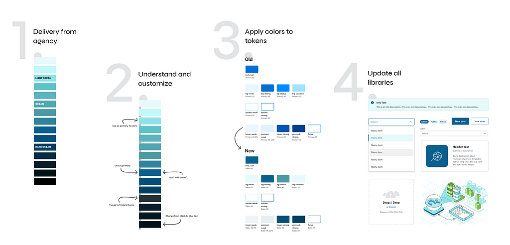
The image above illustrates an example of how we accomplished this challenge by automating the process of adopting the new brand colors. After doing iterative testing of the color palette to generate a new color system, we switched out the old color values from our color tokens.
The color tokens are used by our design and code libraries, prototyping files, and production environments. As such, the token names remained the same and we were able to minimize the work of manual updates. This process can now be replicated in the future to quickly test, iterate, and implement new branding assets.
Helping Products Refactor Fast, in Less Than 2 Days
One of the core objectives of Needle version 2 is to empower our product teams to iterate and adapt quickly. Refactoring user interfaces can be a daunting task, often requiring extensive development and design resources. But with a design system in place, we’ve made the process faster and more efficient than ever before.

Our design tokens, pre-built components, and comprehensive documentation are now more robust and accessible. Product teams can easily find the elements they need and implement them with minimal effort. In fact, we’ve seen remarkable success stories where product teams were able to refactor their interfaces in less than two days using codemod scripts. Needle(ss) to say, this wouldn’t have been possible without the component library providing predictable elements to modify as we moved from one major release to another.
In fact, we’ve seen remarkable success stories where product teams were able to refactor their interfaces in less than 2 days using codemod scripts.
Bridging the Gap Between Web, Marketing, and Product Teams
A well-functioning design system should serve as a bridge between different teams within an organization, ensuring everyone is on the same page when it comes to design and branding.
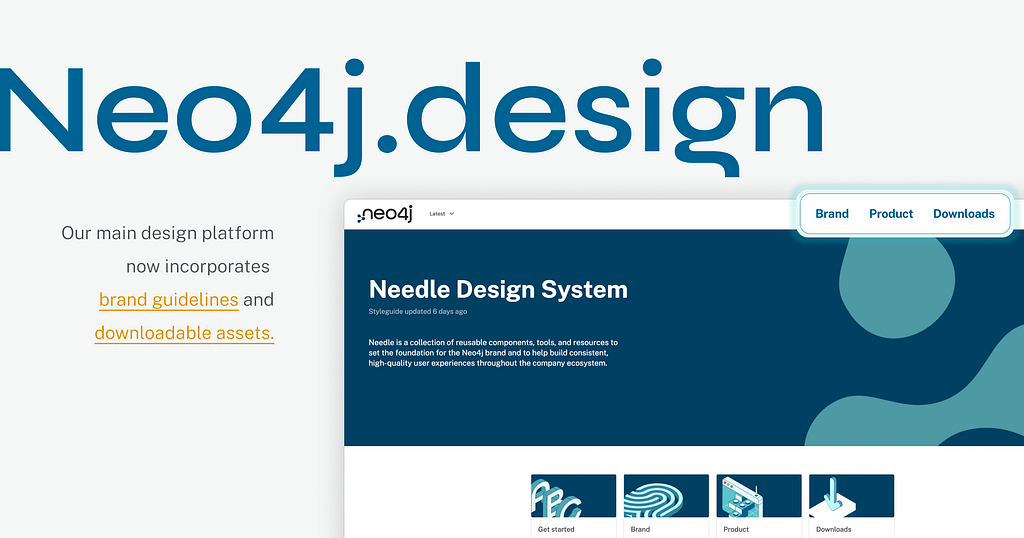
Our design system now offers a common language that brings web, marketing, and product teams together. It fosters collaboration by providing a shared set of design assets, patterns, and guidelines that everyone can refer to. Whether you’re a web developer working on our website, a marketer crafting promotional materials, or a product designer creating user interfaces, we have you covered. Just visit Neo4j.design, and you will find anything you need.
By closing the gap between these teams, we can deliver a consistent and compelling brand experience to our users across all touch points. This not only reinforces our brand identity but also ensures that every interaction with Neo4j feels like a coherent journey.
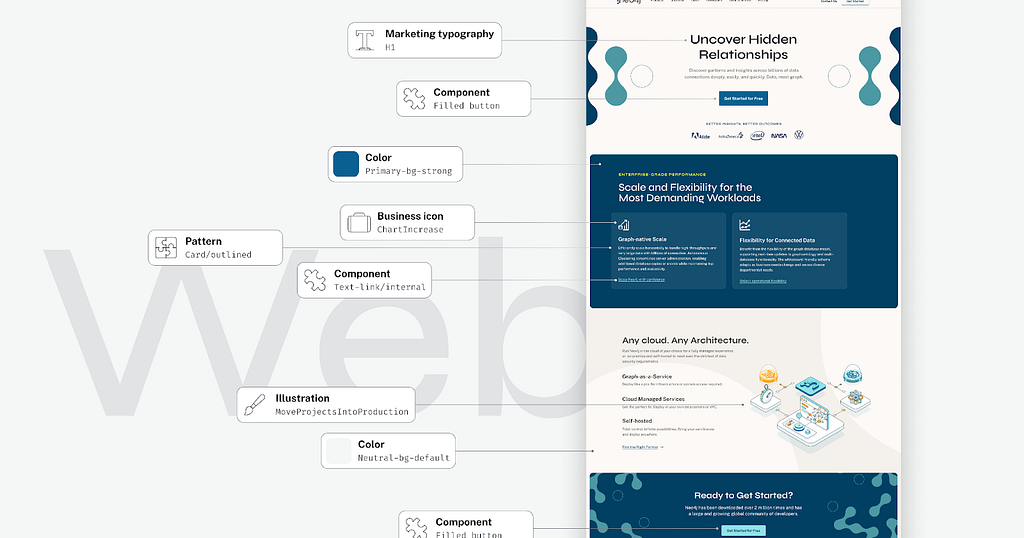
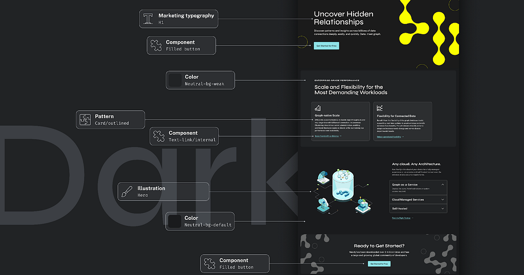
The images above show the same color and typography tokens, components, and patterns used in our products but to construct a new webpage in both light and dark mode.
What’s Next?
Needle version 2 is a significant step forward in our journey to create a cohesive and exceptional user experience across our product portfolio but also reaching beyond our product teams.
By incorporating new branding colors, helping products refactor quickly, and bridging the gap between departments, we are reinforcing our commitment to design excellence. We’re excited to see how Needle 🪡 will continue to shape our products and user experiences in the years to come.
Let us know what you think about the new design, accessibility, and user experience.
PS: We are hiring a new Front-end Engineer for our Design System team. Learn more here.
Front-end Engineer – Design System team (React, Typescript)
Needle v2 Is Here: Rebranding in the Fast Lane was originally published in Neo4j Developer Blog on Medium, where people are continuing the conversation by highlighting and responding to this story.


