Graph Visualization
This guide explains graph visualization tool options, and how to get insights from your data using visualization tools.
Beginner
Neo4j is designed to be very visual in nature. Native graph databases like Neo4j focus on relationships. Visualizing these relationships can give a unique "big picture" to your data that is difficult or impossible to get with traditional tables and business intelligence packages.
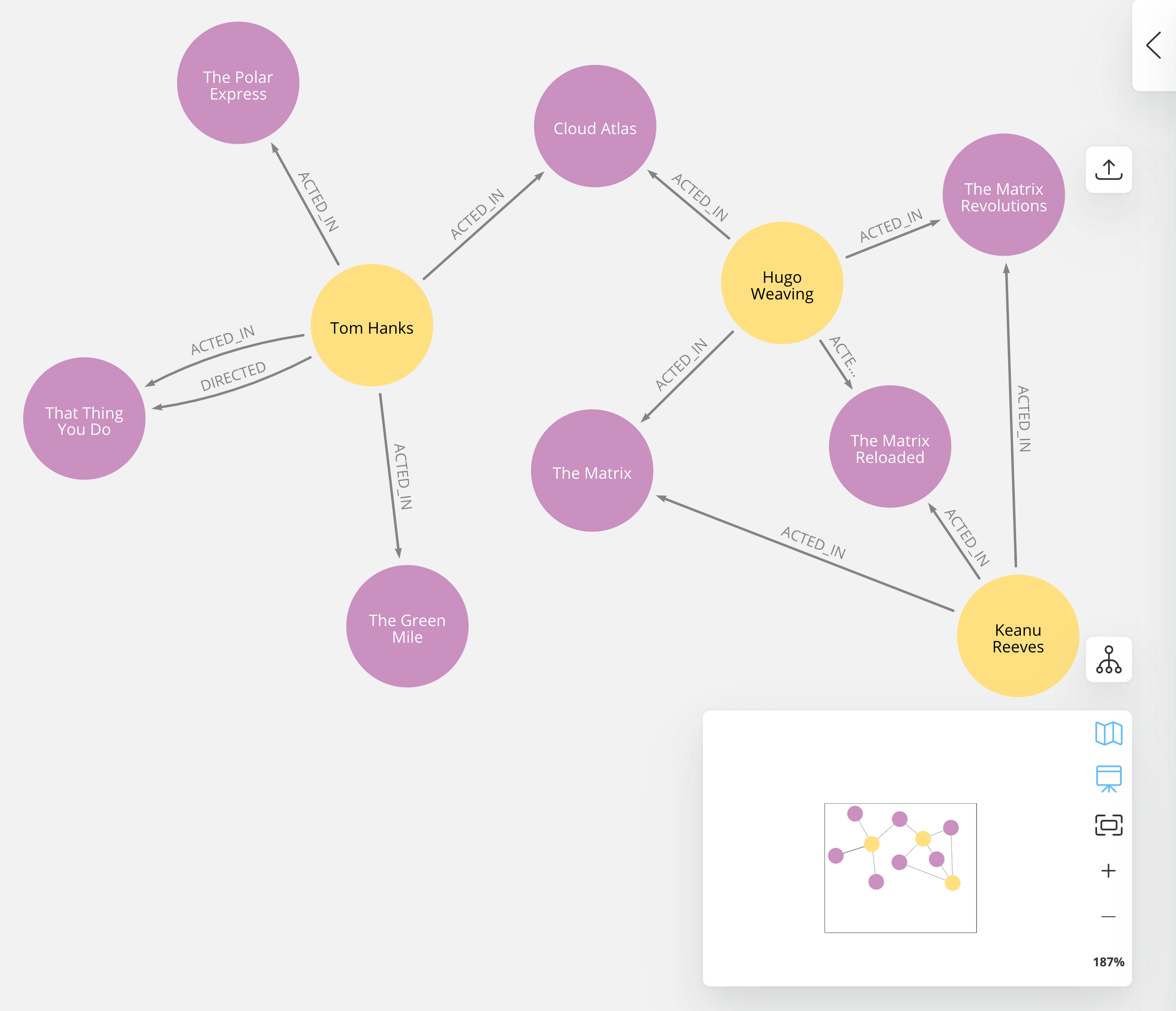
Graph visualization takes these capabilities one step further by drawing the graph in various formats so users can interact with the data in a more user-friendly way. With visualization tools, a full or partial graph can come to life and allow the user to explore it, setting various rules or views in order to analyze it from different perspectives.

This section is designed to help you understand how to export your graph data in Neo4j for display as a visualization, and list options so you can choose what suits your needs.
Why Visualize a Graph?
You have many options for working with data; JSON, XML, tabular, and others. Why represent it visually?
Anyone reviewing a graph can see the connections, determine areas of interest, or quickly assess the current state and organization of the data. As you can imagine, this can provide insight where other types of data formats cannot, bringing enormous value. Visualizations help make anomalies or relevant patterns stand out to help human eyes and brains detect them, where other types of data formats might not highlight hidden structures as well.
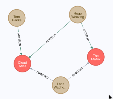
Let us look at a very rudimentary example of this using our movie data from the earlier data modeling section guides.
In the graph view above, we can easily pick out that Lana Wachowski directed both Cloud Atlas and The Matrix movies, where in the tabular representation, that information is not as clear or easy-to-find.

Even if you feel that the relationship is not hard to find in the tabular format, imagine if we were looking at a graph that contained these individuals' entire filmography careers, as well as hundreds of other actors, directors, and film crew members. The connections could easily be lost in a non-visual presentation.
Neo4j Visualization Tools and Products
Neo4j has two main visualization tools that are built and designed to work specifically with data in Neo4j’s graph database: Neo4j Browser and Neo4j Bloom. We will briefly discuss the key details of each here.
Neo4j Bloom
Bloom is a standalone product focused on visualization that comes with every AuraDB Instance, and is available with a Neo4j Desktop. It was designed for business analysts annd nother non-developers to interact with graph data without writing any code.
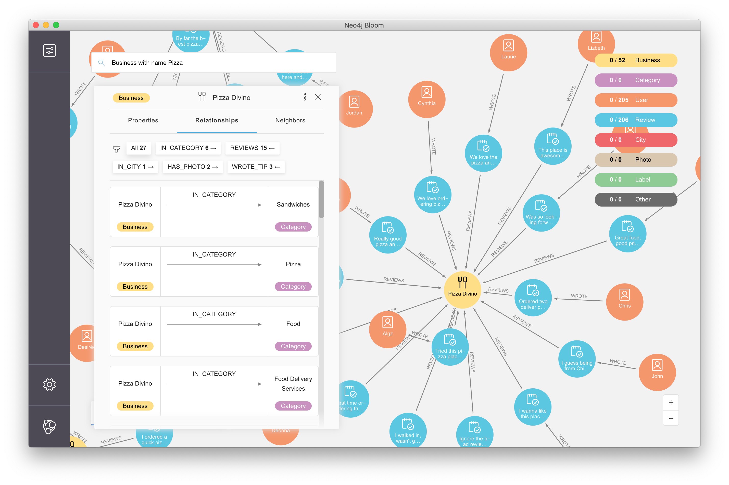
Users can use natural language to query the database and explore patterns, clusters, and traversals in their graph data. It is also possible to create different dissections of the graph (called perspectives) that allow users to view different aspects and slices of graph data for further analysis.
Neo4j Browser
Neo4j Browser is an interactive cypher command shell for developers that allows you to interact with your graph and visualize the information in it. Neo4j Browser is bundled with Neo4j and is available in all editions and versions of Neo4j.

Its visualization functionality is designed to display a node-graph representation of the underlying data stored in the database in response to a given Cypher query, showing circles for nodes and lines for relationships. Neo4j Browser also provides some functionality for styling with color and size based on node labels and relationship types, or you can customize your own styles by importing a GRASS (graph-stylesheet) file for Neo4j Browser to reference. You can also use the built-in drop-down buttons on query result panes to easily export the data to PNG, SVG, or CSV formats.
Alternative Visualizations of Graph Data
Not all graph visualizations represent data in circles and lines for nodes and relationships. Users may want to view data in various chart-based, map-based, or 3D formats.
Chart-based visualizations
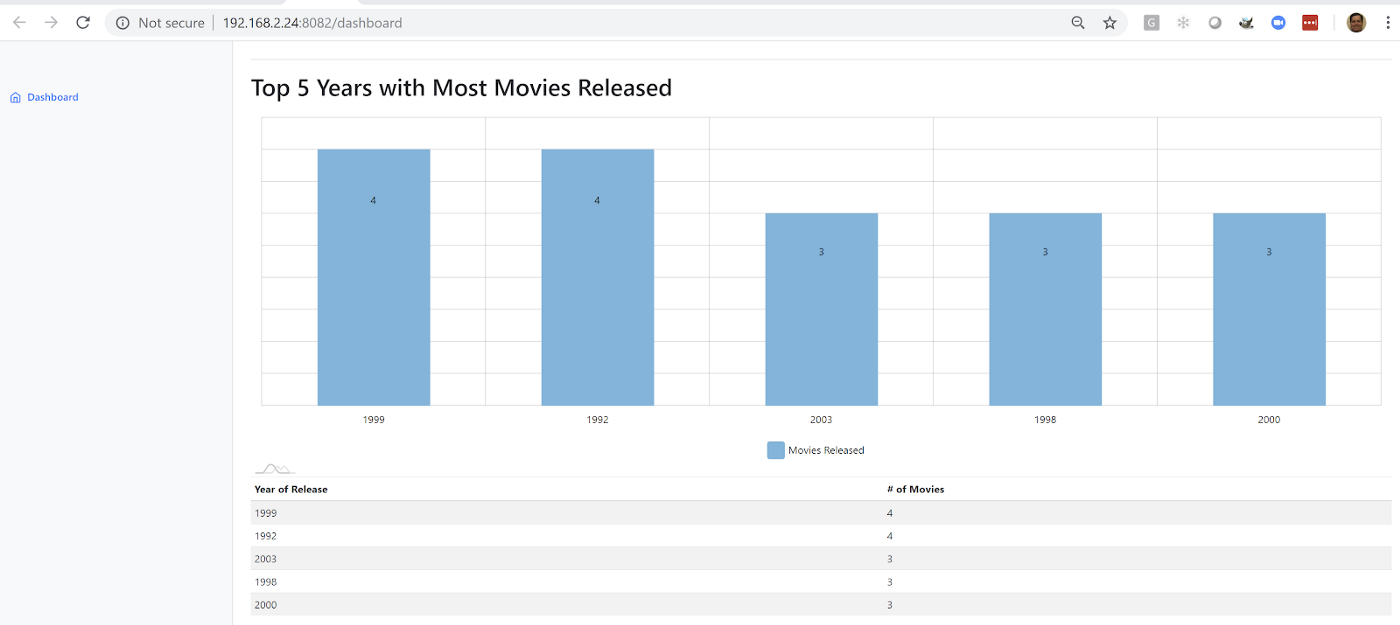
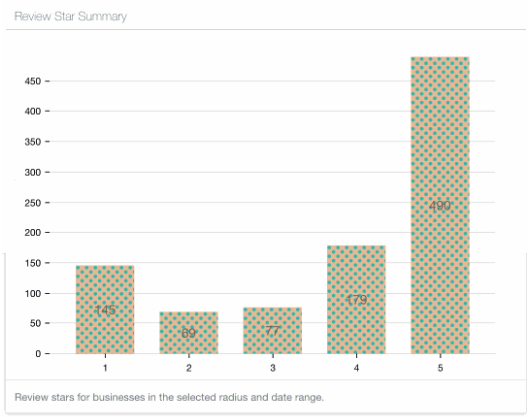
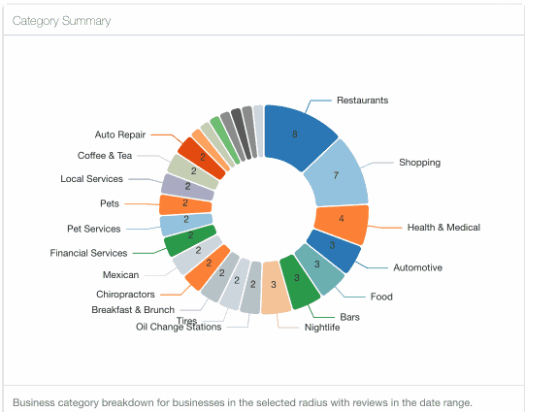
Viewing data in familiar chart formats such as bar charts, histograms, pie charts, dials, meters and other representations might be preferred for various users and business needs. There are tools that support these types of charts for metrics and dashboarding.
There are several open source tools available, but we will mention a few with links that we have used before. Feel free to explore others!
Tableau

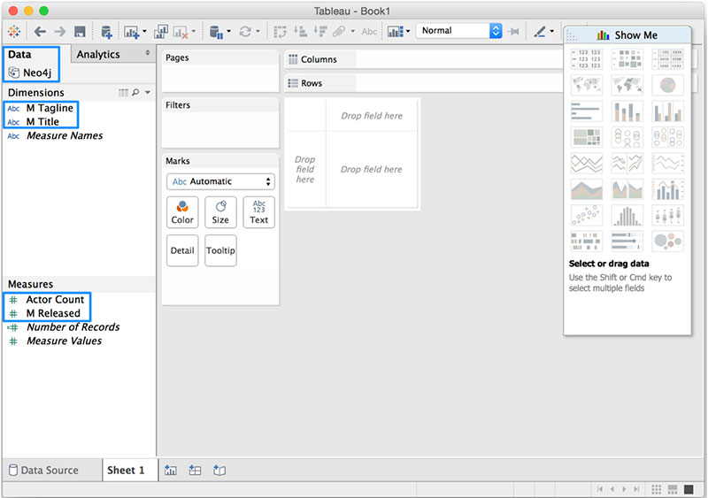
Tableau is a data analysis tool that can take data from a variety of sources and blend or split the data based on user specification. Using the Neo4j Connector for BI you can make a connection between Neo4j and Tableau as you would any other SQL databases, and visualize data directly.
Once the data is in Tableau, the user can interact with a drag-and-drop Tableau GUI to aggregate, splice, and style various combinations of the data into colorized visualizations in countless formats.
Map-based visualizations
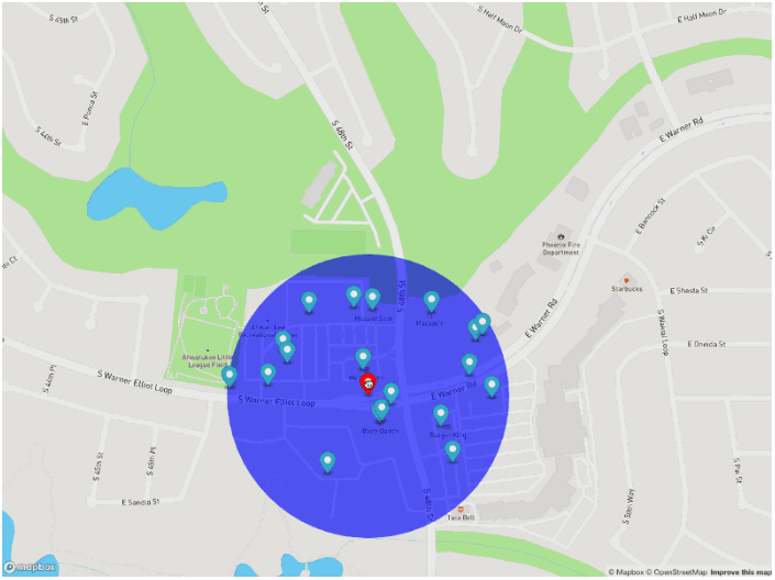
Graph data is an excellent fit for mapping and representing geographic data, as it is laid out by entities and connections (locations/points and routes to get to those locations). Neo4j can help plot latitude and longitude, polygon geometries, routes, as well as distances, so a tool to overlay a map visualization on the front-end of this data provides a great deal of value for interacting and exploring an area.
Commercial tools by Tom Sawyer and Keylines both also support this type of visualization.
Leaflet.js is an open source library that allows us to create multiple layers and show/hide various layers. It is designed to be interactive and function on mobile phones, as well as traditional devices. You can extend functionality with a variety of plugins, including Mapbox. With these tools, you can create a base map layer (such as map tiles) and data visualizations live in map layers that are plotted on top of the map tiles. Mapbox also gives you the capability to add an interactive map.
Leaflet.js Resources
-
Leaflet.js website: Leaflet.js
-
Blog post: Leaflet.js to visualize Paradise Papers data
-
Blog post: Using Leaflet.js and Mapbox to visualize spatial data in Neo4j
-
Example source code: Leaflet/Mapbox spatial Neo4j
-
Example source code: Leaflet/Mapbox interactive map
Heatmap visualizations
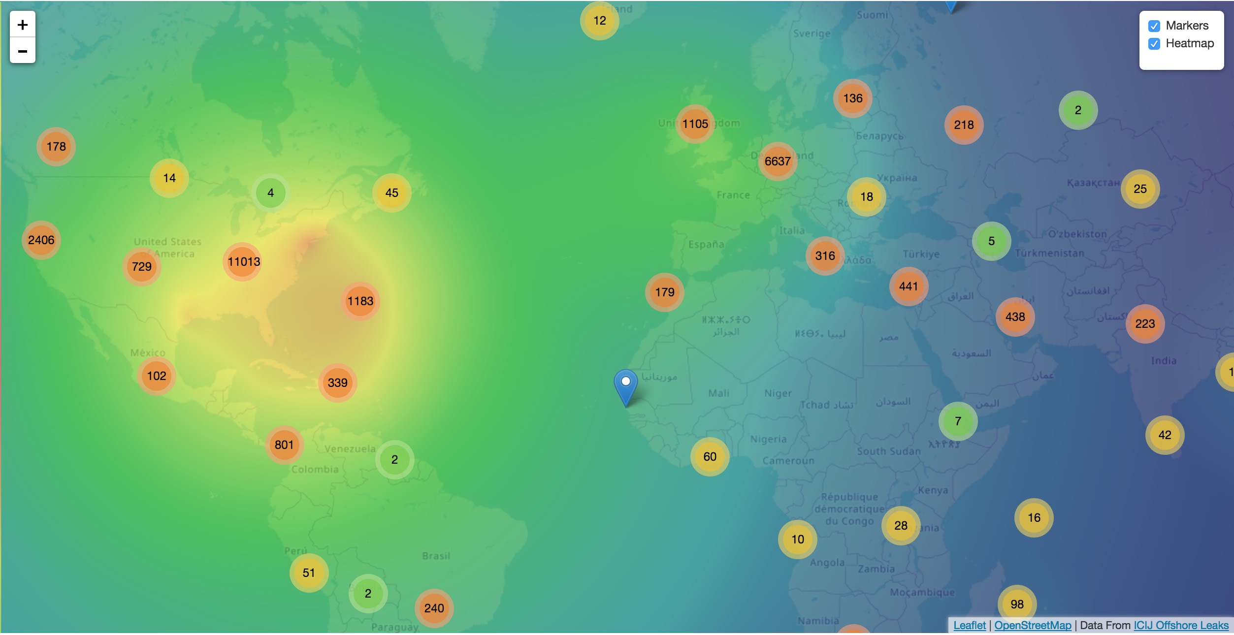
A heatmap is a data visualization where colors are used to represent data values. It is often imposed on a map, but could also be on a matrix as well. When heatmaps are used on a map, pockets of activity may be spread out, so some form of interpolation is often used.
We will list the tool(s) we have encountered so far, but we will add to this as we interact with more.
-
Leaflet.js plugins:
-
Blog post: Leaflet.js heatcanvas plugin
-
3D visualizations

Adding a third dimension may increase some complexity in the visualization, but also adds value. Exploring your data in 3D can help navigate through large amounts of data better and more clearly. Clustering should also be more apparent in a 3D visualization because data can be more spread out when using the third dimension, where 2D can cause groups to overlap or display more closely.
Kineviz (commercial tool) also supports this type of visualization.
With this open source library, there are a couple of different components for handling the physics behind three dimensions and for actually rendering the visualization. It uses an iterative approach for rendering in 3D and creates stunning, interactive visualizations. The tool includes features for customizing styles of nodes and relationships, as well as container layouts, rendering controls, configuring simulation, and user interaction. The data structure required is similar to previous tools we have seen, with collections for nodes and relationships. 3d-force-graph also offers functionality for visualizations to use with virtual reality.
3d-force-graph Resources
-
Source code: 3d-force-graph Github
-
Author post: Example
-
Blog post: Visualizing Graphs in 3D
Other categories
There are still other tools for visualization that may not necessarily fit into the categories we have discussed so far. Instead, they expand the current boundaries and find uniquely powerful ways to utilize graph technologies. Thinking outside the box increases the possibilities of graph even further!

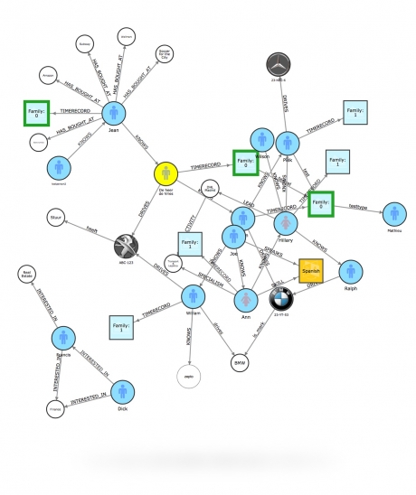
Graphileon is a platform for building graphy applications by composing functions and UI elements. It can be harnessed by users such as consultants and designers for styling and dashboards. Developers can also integrate with other technologies to customize applications, embed views, or extend functionality.
Partner and Community Visualization Tools
Outside of Neo4j’s offerings, partners and community members have built tools and integrations to connect graph data in Neo4j with more graph visualizations. Learn more about options and functionality of these tools in the guide linked below.
Was this page helpful?
